This is a continuation of the “Mobile Web Sensors Using ESP8266” series.
Mobile Web Sensors Using ESP8266 – Phase 1
Mobile Web Sensors Using ESP8266 – Phase 2

Google Map and Excel Visualizations
This is where things get interesting. I just got back from a yoga class. This was a simple 4 mile bicycle trek across town; a perfect opportunity to collect some data using the Mobile Sensor System.
For this test run. a USB battery was used to power the ESP8266-12 based device. I simply plugged a USB cable in to powered it up, stuffed it into a fanny pack, connected my Android phone to the device’s WIFI signal and started the App.
I could tell it was working by observing the UTC time change rapidly on the phone app’s GUI. Another look at the display upon arrival at my destination confirmed that the data collection was still running. Success!
But the raw data file was not in a very human readable form:
timestamp,lat,lon,spd,alt,btmp,dtmp,bp,dh,syst,sysh,syslp
1439830613611,34.2943768,-118.8439855,null,null,80.6,57.79,29.23,50.70,120,30840,37
1439830614632,34.2943768,-118.8439855,null,null,80.6,57.90,29.23,50.59,121,30840,38
1439830615646,34.2943715,-118.8439865,null,null,80.24,57.90,29.23,50.59,122,31280,39
1439830618611,34.2945713,-118.8441038,0,180,80.24,57.90,29.23,50.50,125,30832,42
1439830619607,34.2945664,-118.8441046,0,180,80.24,57.90,29.23,50.50,126,31280,43
1439830621616,34.2945921,-118.8441143,0,181,80.42,57.90,29.24,50.50,128,30840,45
1439830625549,34.2945638,-118.8440880,0,175,80.42,57.90,29.23,50.40,132,30840,49
1439830625649,34.2945638,-118.8440880,0,175,80.42,57.90,29.23,50.40,132,30840,49
1439830627653,34.2945510,-118.8440810,0,175,80.60,57.90,29.23,50.40,134,31280,51
1439830630563,34.2945510,-118.8440807,0,175,80.60,58.0,29.23,50.79,136,31280,53
1439830631631,34.2945508,-118.8440805,0,175,80.60,58.0,29.23,50.70,138,29112,55
Collecting this sensor data and saving it to a file was an important step. And now, the next thing to do was to present the data in a visually useful format. I had intended to import the CSV file containing the data into Excel. However, while creating custom Excel spreadsheet charts and graphs was a quick and simple method of visualizing the data, my first approach was to seek out possible on-line tools already available for this purpose.
So the search began. It did not take long to find a way to import the spreadsheet into google maps. But would it be simple? would I have to crop out the latitude and longitude values from my data file for the mapping program to use it?
I was surprised at how easy it was…
The web site was www.gpsvisualizer.com.
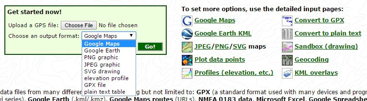
After opening a web browser to that site, you simply click on “Choose File” and select the csv file created from the Android App.
Then, just click on “Go” and a satellite map with the tracks from the data appears.
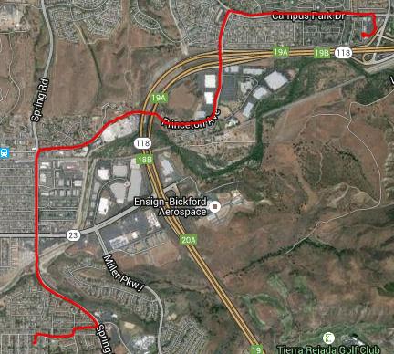
No changes to the csv file were needed. What a great tool! It figured out the appropriate data fields for lat & long and overlay-ed them on the map with a red trace.
Okay, what other options are available with this “GPS Visualizer”?
The “Choose an output format” revealed several image options as well as an elevation profile. The elevation profile looked like it might be interesting…
But I noticed the default units were meters. Being a US resident, feet are preferred. These units, along with many other options, were select-able by clicking on the link “Profiles (elevation,etc.)”.
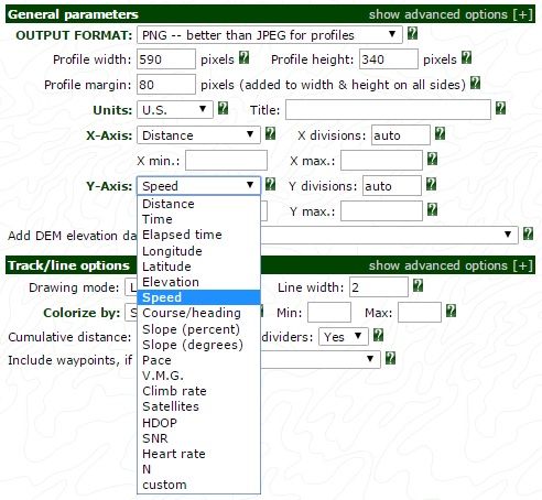
Here, you could set the X and Y Axis plots to any of the fields shown above. I was stoked to see the list included “Heart rate”. My Heart rate sensor will be added to this project at some point soon. Plotting it against elevation change should present some interesting results.
I created a test plot of elevation over distance traveled along this 4-mile route. While any field could be selected, this sample plot colorizes the speed. Again, the plot shows the speed to generally stay below 20 mph, typical for city street bicycling.
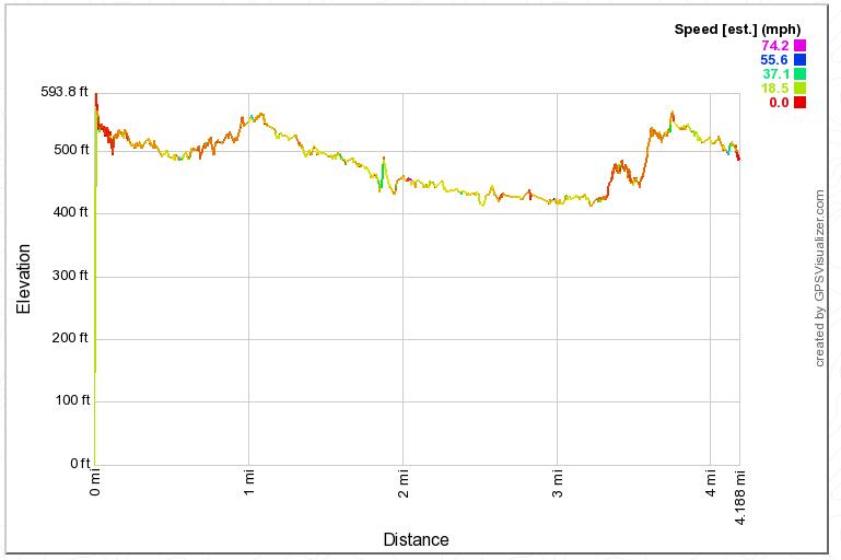
That steep slope (and slow speed–red plot color) at about the 3.5 mile distance correlates with the only significant hill climb along the route. Nice to confirm that the data collected makes sense!
But then it hit me. Nice to see that this “GPS Visualizer” can portray the GPS data in charts…but what about the customized sensors? Like temperature, barometric pressure, and the relative humidity? Could this tool also support these unique fields in the plots?
I was pleased to discover that the answer is…
YES!
Note that the last field in the drop-down above is “custom”. Selecting this option allows you to enter any field name. Those are the field names in the first row of the CSV file of the data captured with our mobile sensor system. I selected “humidity” for the y-axis as a test case with a colorization of the speed.
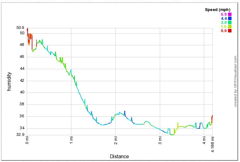
I was surprised to see the drop in relative humidity from the start to the finish of the ride. It was probably due to the sensor drying out someone with motion. It had been in the controlled, air conditioned environment of the yoga studio at the start and was then exposed to our dry Southern California air.
Looks like this “GPS Visualizer” tool will come in handy to produce quick charts from the sensor data.
Visualizations Using Excel
While most everyone if familiar with excel, this discussion would not be complete without a few chart example produced from the raw CSV file.
But when the CSV file was opened using Excel, a couple of issues had to be addressed first before plotting the data.
- The timestamp field was shown in scientific format. this was corrected by changing the format from “General” to “Number” with 0 decimal places.
- The first 3 entries for the spd and alt fields were “null”. These were changed to the value of the 4th entry, the first one with valid values. Note: these values came from the GPS API in the Android code. Neither one accurately represents the actual speed and altitude. Yet the google plots were accurate. This problem was due to assuming the parameter units incorrectly:
- The altitude was reported in meters. Since we were looking for feet, it must be converted using the scale factor
of 3.28084 feet/meter. This has now been corrected in the Android App code. - The speed is reported in meters per second. Since we were looking for MPH, it must be converted using the scale factor of 2.23694 miles/hour per meter/second. This has now been corrected in the Android App code.
- For the evaluation of the data collected in excel, two columns were added to perform the conversion: MPH and altitude.Problem with the speed, however, is that many of the samples returned 0 meters/sec as the speed. To solve this, I may introduce a new speed algorithm to the mobile app code to convert two GPS coordinates to distance. This distance, along with the change in timestamp values would be used to calculate speed.
- The altitude was reported in meters. Since we were looking for feet, it must be converted using the scale factor
- The “dtmp” values (temperature as read by the humidity sensor) are incorrect. The temperature starts at 57.79 degrees while the temperature read by the barometric sensor starts at 80.6. It looked to me like the conversion is missing the “plus 32” in the ESP8266 code. But a review of the code did not reveal any problems. The conversion did include the required “plus 32). I would like to hear from anyone else using the DH22 to see if they are all off in temperature or it is just my sensor that is incorrect. For now, the DH22 temperature reading will be discarded as invalid.
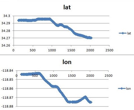
The first thing I tried was to plot the coordinates over the ESP system time(seconds since reset).
Problem with this plot is the relatively small change in latitude and longitude. It essentially looks like a straight line. This was easily rectified by plotting the latitude and longitude separately.
Okay, and now let’s plot the elevation again, like we did with the GPS visualizer.
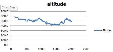
Yes, this does look the same as the GPS Visualizer. Except colorizing the plot with a 3rd parameter is not an option. Even with just these few sample plots, I am definitely liking the visualizer of standard Excel charts.
Conclusion
As you can see, there is more than one option available to visually represent data collected with IoT sensors. And it is worthwhile to investigate tools that may be readily available before attempting to build your own charts, from scratch. Here we just explored a fraction of what is available for this purpose.
Phase 4: Mobile App Gadgets is next. In that post, I am going to add some visualizations to the Android application. This will add a real-time visual element to the crude data windows created in phase 1.
I hope you find this information useful…